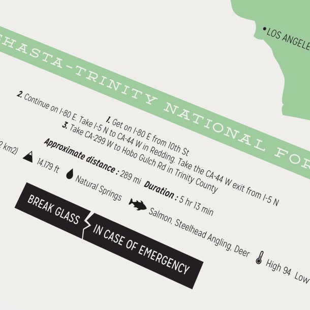
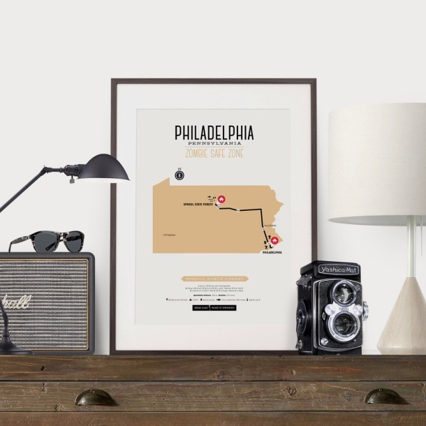
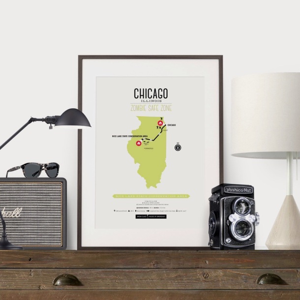
The zombie apocalypse has finally happened and you need to leave your city fast! As panic sets in you quickly remember that to survive a zombie apocalypse you need to find a safe zone, somewhere where there’s a natural abundance of water, fish and forestry. Somewhere far away where in an isolated place. You decide to Google map a location to search for a safe zone but WAIT, all systems are down. How do you find your safe zone!
Have no fear. These zombie safe zone maps are here to help. These state maps highlight the most popular cities that are prone to outbreak. With these maps you will be able to safely escape the apocalypse with exact routes to your safe zone.
Each map highlights a from and to point explaining directions, distance, time, and additional information about the safe zone like water type and food resources. Own one or own them all to be extra prepared.
Find your safe zone map here.


Can’t find the map you are looking for? We also came out with a CUSTOM MAP listing where you can enter in your location and we will send you a personalized map with from and to points.

See all the maps here.
Share this:

Our new poster tube packaging is here! We spent some time really trying to figure out how these were going to be laid out. We know we wanted to brand our selves however printing on tubes isn’t cheap. So instead we decided to go old school and had a custom made stamp which we ink and roll by hand onto each tube. Crazy I know;) To add a little extra we purchased a massive roll of custom stickers that are placed on the end caps informing our customer to visit our post care page which explains how to open and uncurl their newly purchased poster. It’s an added cost however I think it will help our customers in the long run. What a super fun project!

Share this:

So you have spent your time and money on a wonderfully inspiring print you found online that will get loads of attention from your soon to be jealous friends. You receive it in the mail and take it out of that durable 3″ shipping tube and have followed our tips to uncurl and flatten that beautifully designed piece of art. Now you need to frame it! Well no worries, we have some great tips to help make framing your art a snap.
1. Color options
Simple and clean is often better. Try looking for colors that don’t detract from the art work. A simple black frame is often the wisest solution because as they say ‘black goes with everything’. If you don’t like the starkness of a black frame you can try white or even steel as it will reflect the light and brighten up your room. If you choose to go with a colored frame like a solid or even wood grain, make sure the colors in the frame have some of the colors in your print. Matching the colors is very important as it creates unison and won’t detract the eye away when viewing. 
2. Style of frame

3. Selecting a Mat

4. Where to hang

There you have it 4 simple steps to frame you newly purchased print. With any luck your friends will be jealous in no time! Any other question or concerns about framing you next print leave a replay below and we will be sure to help you out.
 –> Become a Subscriber and Receive 25% OFF!
Sign up to see all our latest work and exclusive behind the scenes stuff. PLUS receive 25% OFF your first purchase.
Share this:


Want to win this set of 3 musical inspired poster quotes!
To enter simply visit our Design Different Facebook Page and leave a comment telling us which poster quote of ours is your absolute favourite. See our selection here.
The winner will be randomly selected on June 9th. GOOD LUCK!


Share this:


You have shopped our site and spent hours determining which poster to purchase. Once you’ve selected that awesome piece of art you think will fit perfectly between your sofa and mid-century modern hutch, you sit back and wait patiently for your beautiful one of a kind poster to arrive in the mail. A week or two later in arrives! It’s packaged in a sturdy 3″ ridged tube and that delicious poster is inside waiting to be revealed. But wait! You have concerns in opening your precious art because you are overly paranoid about crushing it or bending it. Well have no fear, this detailed step by step guide to opening your poster print will help ease your worries.

Pull off one end cap.

Tip the tube over so the poster slides out naturally. Do not grab, pull or pinch the poster trying to extract it. This my cause bending creasing of the posters edges.

Once the poster is out, use your tube as a fun megaphone, or simulate a Darth Vader voice.

Peel the sticker off the rolled up poster, be sure not to squeeze the poster to hard as you may bend it. Do not use scissors or a knife to cut the sticker as this may cut the print damaging it and your soul.

Carefully take out your print from the protective polyethylene bag and roll it out on a clean flat table and place a clean heavy flat item like a book on either end of the poster. Then sit back and relax while watching re-runs of Mash or Golden Girls all night long.

If you find step 5 too long of a wait you can alliteratively use the poster tube as an uncurling device. Wrap your poster around the tube in the opposite direction of the curl and tie two elastic bands on either end. This will provide maximum de-curling power, however it provides greater risk in damaging the print, so be careful when attempting this alternate option.

Well there you have it. Your poster is now ready to be framed and hung perfectly between your sofa and mid-century modern hutch just waiting for your friends and family to compliment you on your modern yet sophisticated style.
Like what you are reading? Sign up to our mailing list to see all our latest work and gain access to behind the scenes stuff. SIGN UP NOW!
Share this:

A few months back I came across this great quote by Henry Ford.
“If I had asked people what they wanted, they would have said faster horses.”
– Henry Ford
I love how this quote expresses Ford’s passion and determination in making his vehicles. His goal was to change the face of the world, do develop a mode of transportation that was unheard of and he wouldn’t let anyone pursued him otherwise.
First we began with some sketches.
I started coming up with different car grills not knowing exactly which one I’d end up illustrating.

Second I researched Ford cars.
In illustrating this quote I took a look back at a ton of Ford models throughout the ages and finally landed on his infamous 1929 Ford model T.

Third I started illustrating the idea.
I started out with the idea to detail out pieces of the Model T car, but ultimately ended up minimizing it to keep the piece more direct and less cluttered as you can see in the time lapse video below.
You can view the final print now in store.

You can view the final print now in store.
Like what you see? Sign up to see all our latest work and gain access to behind the scenes stuff. PLUS receive exclusive offers not mentioned anywhere else.
SIGN UP FOR OUR NEWSLETTER
Share this:

Wanted to share with you all a great little feature in UC Quarterly magazine. Under Consideration comes out with quarterly magazines that features all the great fun-to-see projects they publish on all their online networks. And our undies print was one of the many amazing selects! Big thanks to Armin Vit of Under Consideration.


Share this:

From the greasers in Outsiders to a large whale in Moby Dick, this weeks inspiring book covers, covers them all. Have a peek at some of our favorite, fun and unique cover art.

Found on sosmithydesign.com

Found on movies.nytimes.com

Found on bookcovercollections292.blogspot.com

Found on picador.com

Found on olivermunday.com

Found on lovelybookcovers.com

Via Desirae Friesen

Found on etsy.com

Found on brainpickings.org

Found on pixelcurse.com

Found on stylishwebdesigner.com

Found on tressugar.com
Share this:


Owning your own online business can be amazing and super rewarding, and with like most jobs, yes it’s still a job, there are good things about it and bad things. In this post I’ll explore one bad thing that most of us may experience. That horribly awkward and insecure feeling of having your photo taken. Also I’ll show some steps to make it quicker, more efficient, and more eye catching so you are not not spending an entire day giving your best Zoolander pose;) Even if you don’t have fancy equipment and great lighting you can still take amazing shots. All it takes is a little prep and creativity.
STARTING YOUR PHOTO SHOOT
First of all it’s very important that you present yourself as, well yourself! I took most of them down in the old factory district of Toronto because of all the character. There’s some great features like industrial brick walls, old windows and doors. As humiliating as it was, at the end of it all I had a lot of fun doing the shoot.
TIPS ON SHOOTING:
Here are a few tips on what to do to make your photos look great:
- Shooting outdoors is your best bet when it comes to budget and quality. Try shooting on a cloudy day because the sun can have pretty harsh lighting at times and may not be very flattering.
- Try taking shots panned out a bit, meaning shoot wide. If you are not printing them out you have the luxury of cropping into the shot and still retain quality.
- Try leaving some space in the shot so that you can fit in some text later. Shoot one third or two thirds and imagine where copy may super impose over top of that image.
- Try looking for interesting textures and details in the background. This can add to your shot and make something more appealing. On the flip side try shooting on white or a solid colour. You can then edited that shot later and stretch the background to seem larger.
- No matter how awkward you feel keep shooting. What you want is a few hundred selects to choose from so you have those variations to play with, and later you can weed out the ones that didn’t work. I think maybe 500 photos were taken during my shoot.
- When posing try a few different shots were you’re looking into the camera, away from the camera, up, down, left, right, try things like jumping, making faces and looking off into nowhere’s land, smile, frown and look perplexed. Try showing your personality a bit highlighting the things that make you, you.

Well there you have it. Those are a few of my suggestions on how to manage a better photo shoot to make the process go faster. Remember there’s only one you, so make sure you highlight that. Try different poses, faces and backdrops. Try shooting outdoors to help with lighting. Leave space in your photo for copy. And most important, try having fun!
FINAL PHOTO SELECTIONS TO COME!
I’m still working on selecting my favorites from the shoot, so stay tuned and I will have them up shortly.
To be notified when they are uploaded Sign up to our Newsletter.

